Toronto Maple Leafs Branding
I had the honor of leading the Reebok NHL design team to rebrand the Toronto Maple Leafs ahead of their centennial season. Throughout the process, we worked closely with Brendan Shanahan and the MLSE executive team to build an identity rooted in the club’s history. This new identity is inspired by 100 years of Leafs hockey and forged for the new generation.

Maple Leaf Forever.
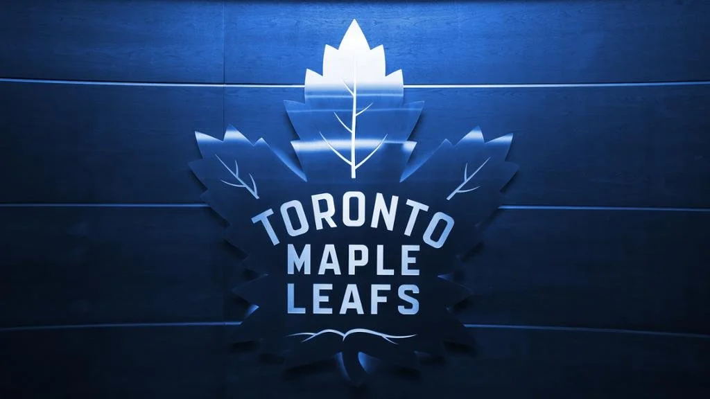
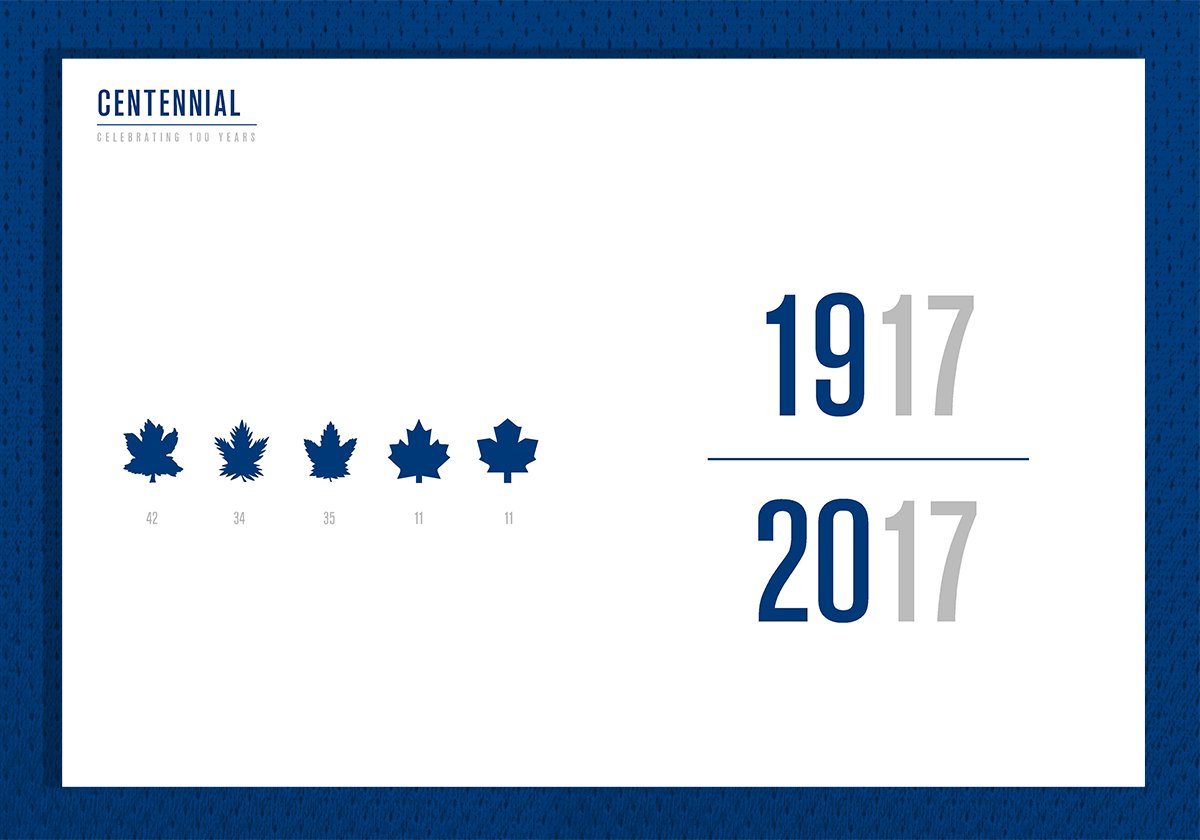
Inspired by the franchise’s history, the new logo marked the beginning of the Maple Leafs' centennial season in 2016-17. The goal was to connect the team’s championship legacy with an exciting and proud future for Leafs Nation.
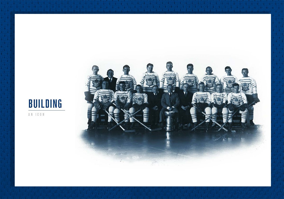
Building an Icon.
Here’s a brief overview of the design deck we presented to the NHL and Toronto Maple Leafs executives. Following a deep dive into the archives, we made sure that every detail on the crest and uniform had a number of design characteristics.
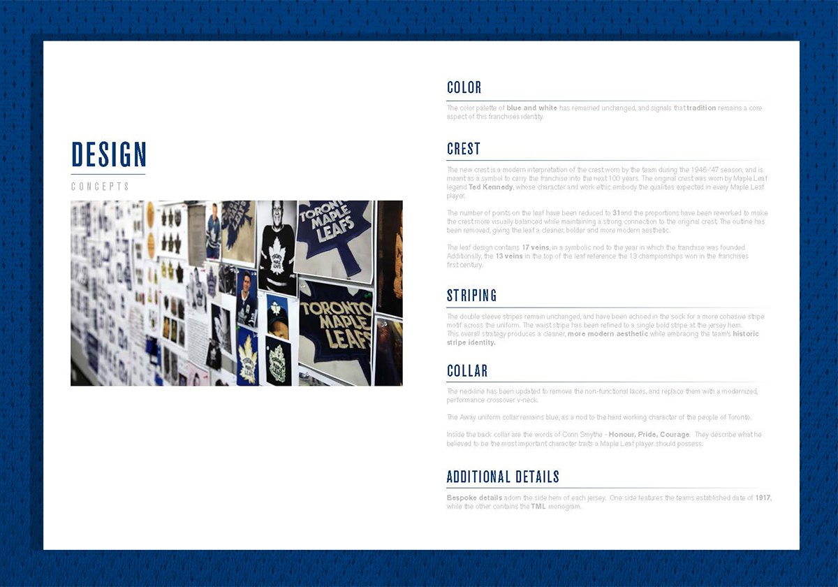

Toronto Maple Leafs Uniform Design.
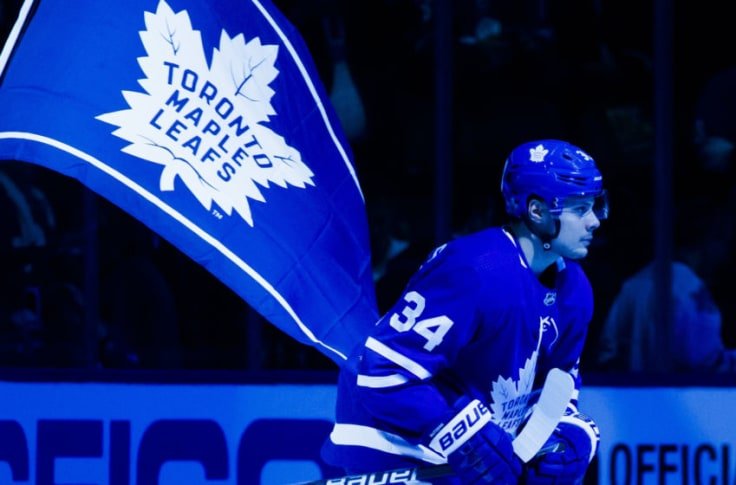
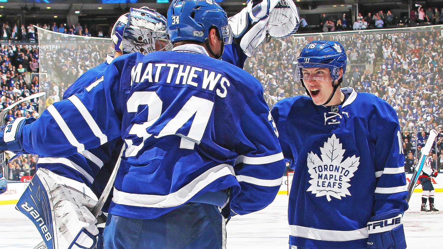
Utilizing a lace up collar with an oversized front crest, while embracing the team’s historic striping design.
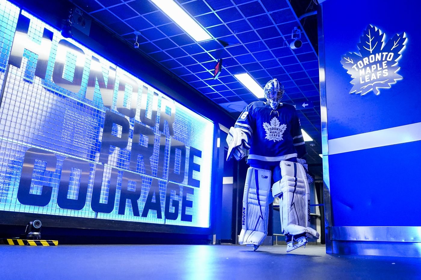
“Conn Smythe spoke of his team wearing the maple leaf badge with ‘honour, pride and courage’ and those words are now stitched into the collar of each sweater so that our players, and fans, are reminded of that every time they put it on.”
— Brendan Shanahan, Toronto Maple Leafs President & Alternate Governor


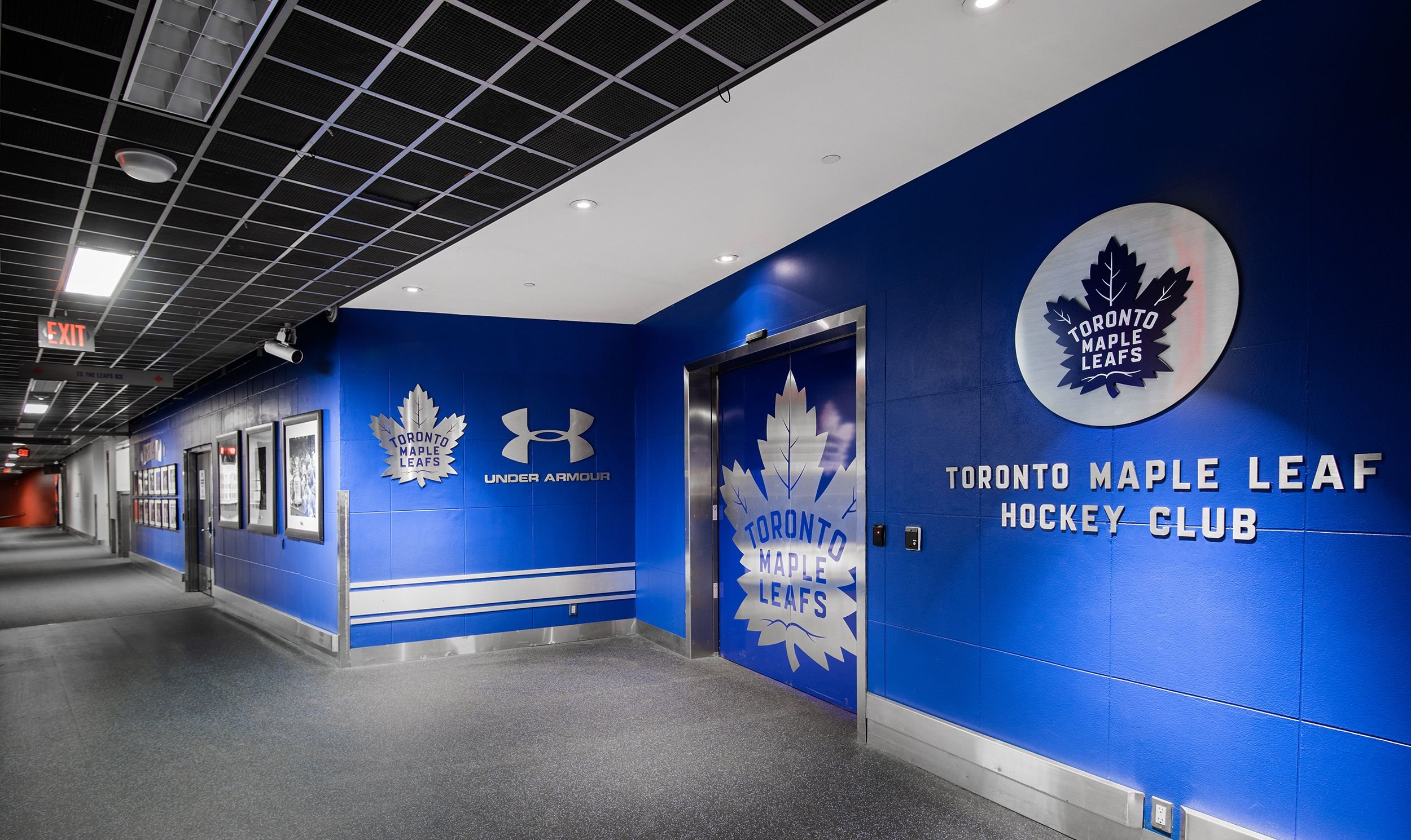
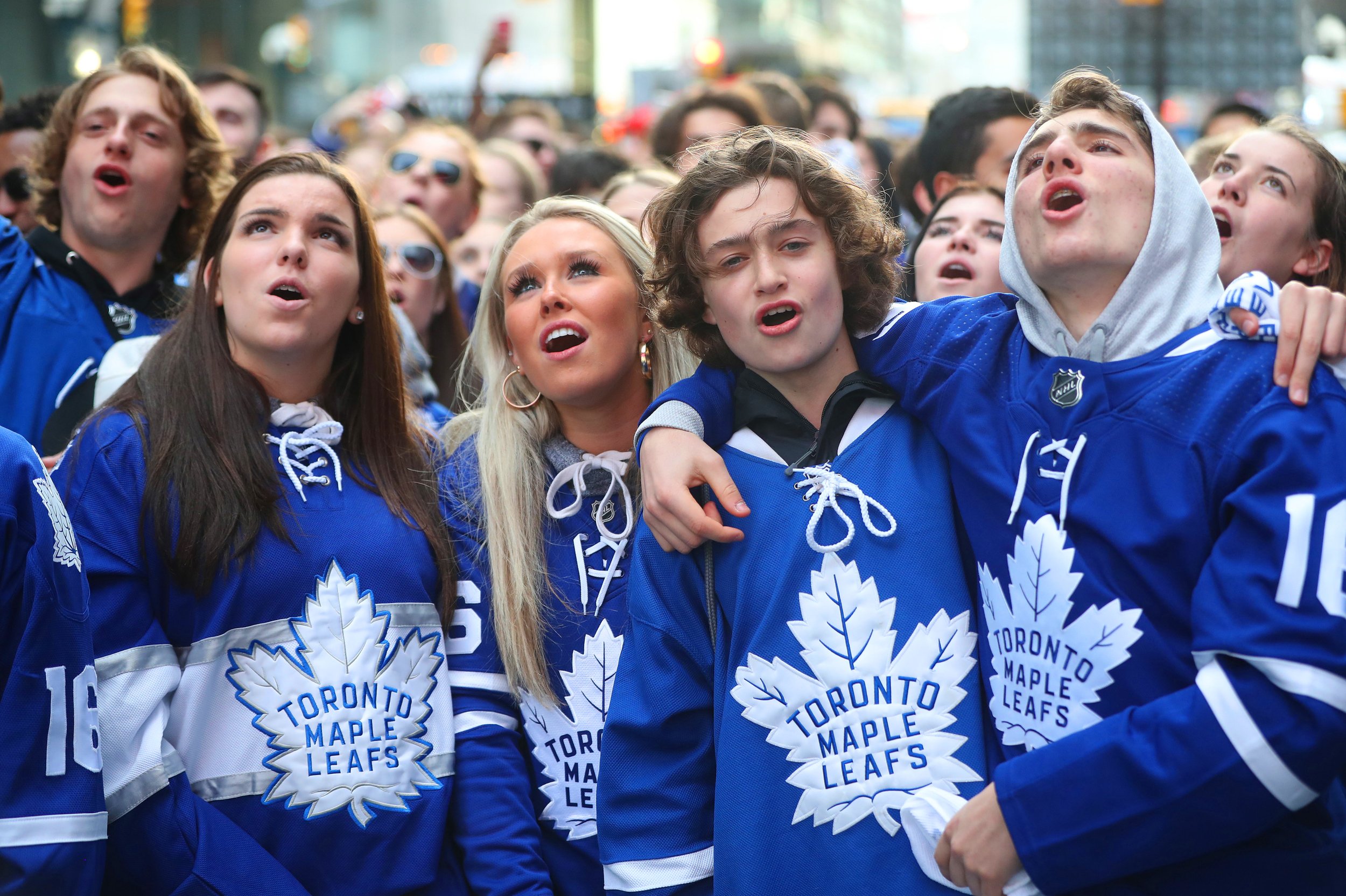
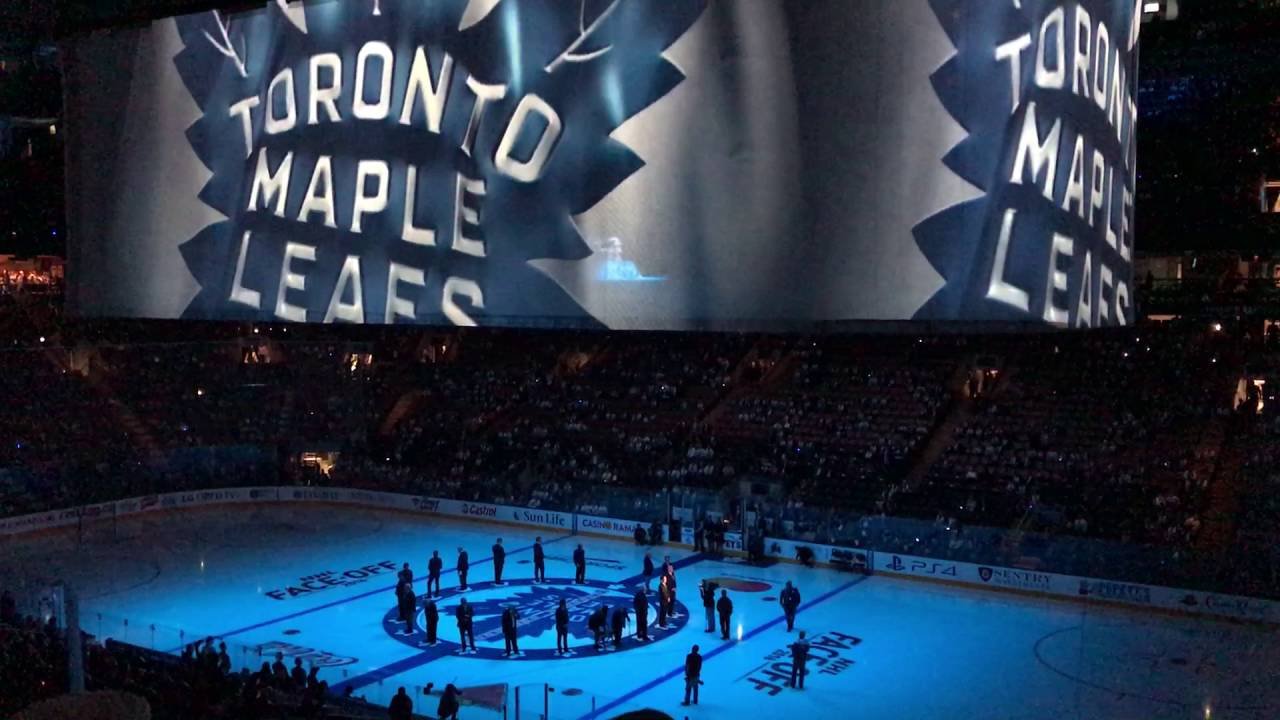
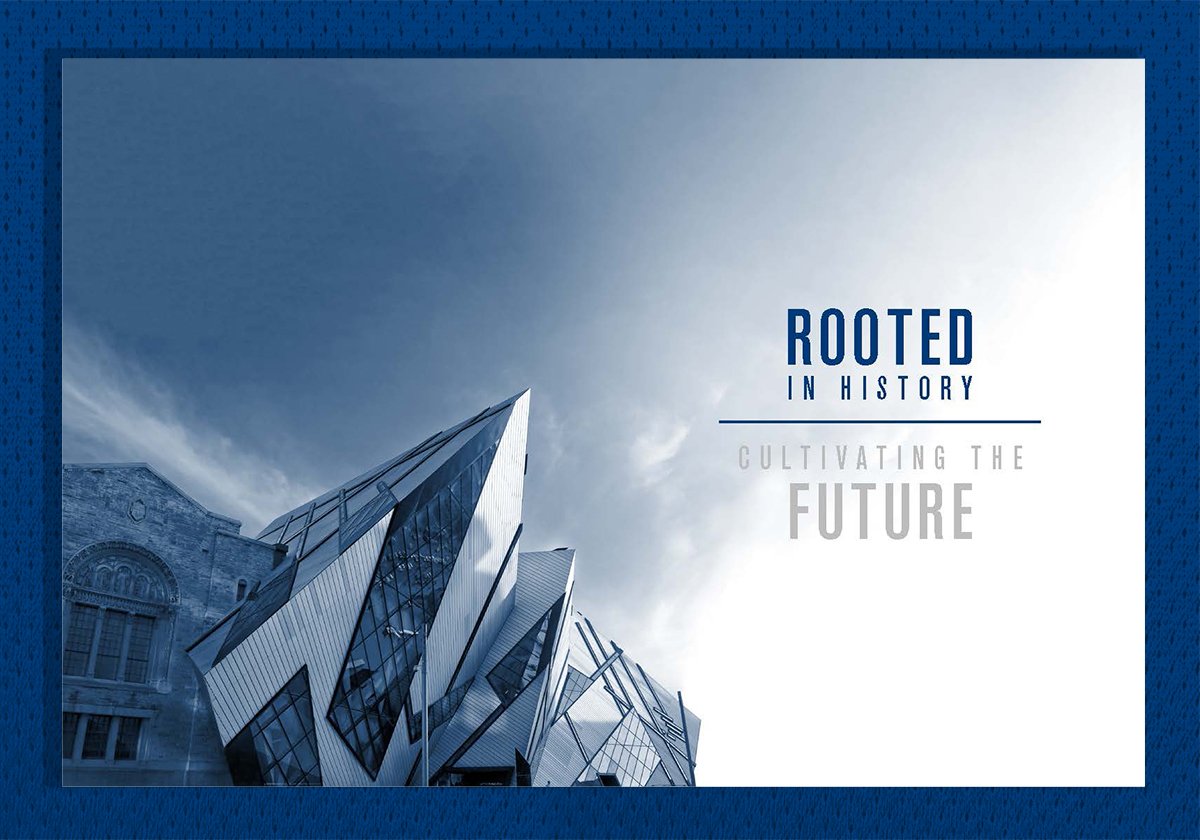
The Next Chapter.
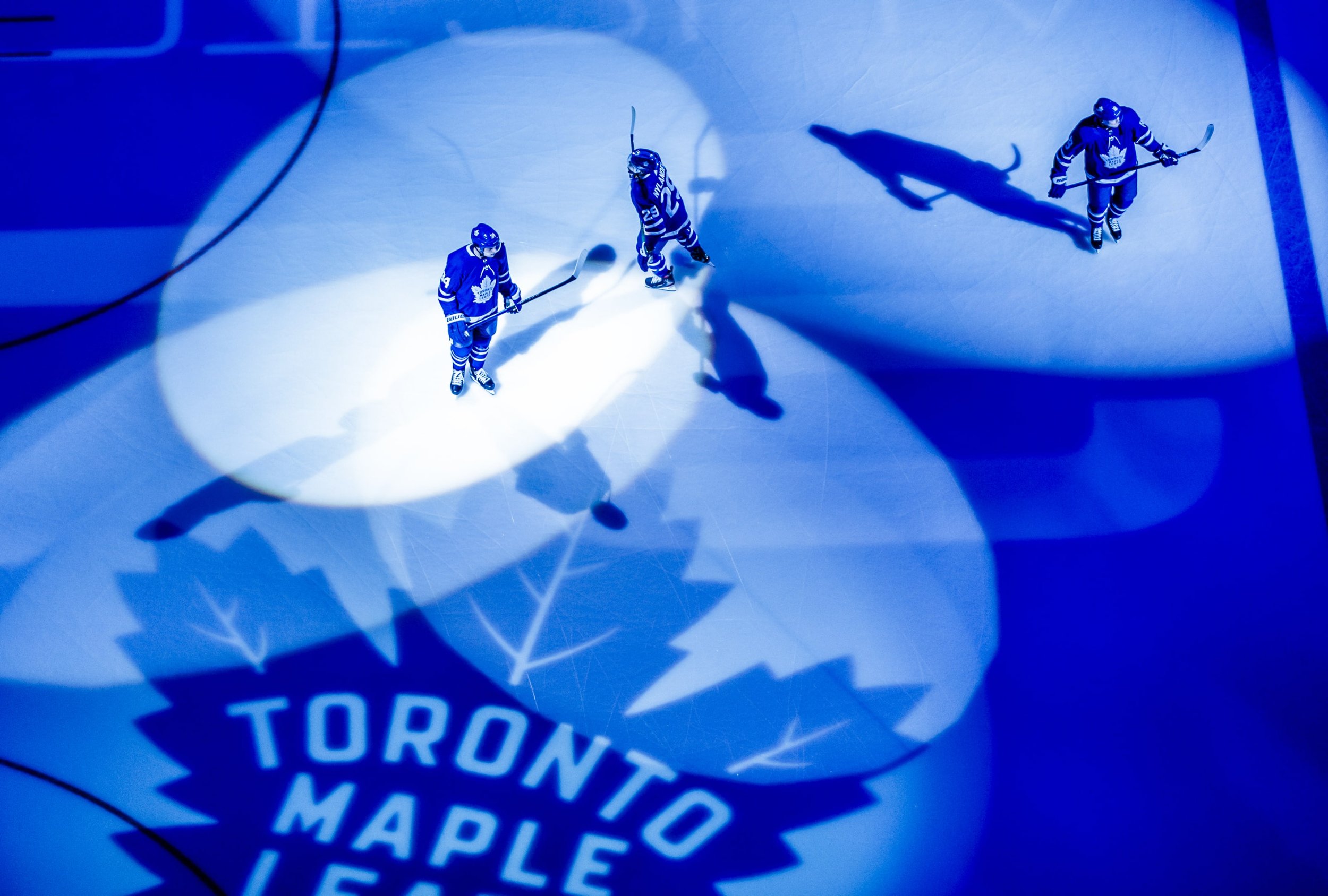
Various real-life examples of the new Toronto Maple Leafs branding. The rebranding helped to establish and unify Leafs Nation around a clear vision for the next 100 years of hockey in Toronto.